Fragrant Posted January 21, 2016 Author Report Share Posted January 21, 2016 Thanks, I'm thinking about redesigning some parts of both of them, to match the others more. Anyway, some lineart:http://i.imgur.com/MrTzQDS.jpg EDIT: Redesigned gryphon and Dragon, dragon looks cooler, but gryphon still interchangeable with his old design, but I might leave him with the new design. http://i.imgur.com/MVDrU8c.jpg http://i.imgur.com/SMz31vh.jpg Quote Link to comment Share on other sites More sharing options...
YUNG MASTERLESS GLENCOUR Posted January 21, 2016 Report Share Posted January 21, 2016 honestly i like the normal gryphon more the dragon tho, man thats a hell of a design. I think I like the cartoonishly deep red instead but otherwise im all in on that its just really rad Quote Link to comment Share on other sites More sharing options...
Fragrant Posted January 24, 2016 Author Report Share Posted January 24, 2016 TTL: True, although something about him bothered me, so I've re-designed him yet again. This time slimmer, with a different color scheme that doesn't conflicts with his rival. True, this is the best version of the dragon, it really embodies his affinity for melee combat while emphasizing he's a dragon. Yeah, I should play around some more with the red, make it the red on his old design, needed to try out deep red anyway. Anyways, new gryphon design, had to make a definitive reference pic so I don't mess up when drawing him from other angles. I think he's at the level of his dragon rival now, design-wise. I need to play around with the blue a bit, maybe sky blue next time.http://i.imgur.com/n13EgXm.jpg http://i.imgur.com/mgZSNUb.jpg Quote Link to comment Share on other sites More sharing options...
Nomrah Posted January 24, 2016 Report Share Posted January 24, 2016 I like this Gryphon much better, It's less USA. Quote Link to comment Share on other sites More sharing options...
Fragrant Posted January 25, 2016 Author Report Share Posted January 25, 2016 Nomrah: Thanks, yeah, better color scheme. Anyway, wanted to see how I'd do with a diffrent sprite style, but it takes longer than what I used for the game. http://i.imgur.com/WK9viQd.jpg I probably won't sprite the rest of it, but it's for a fighting game. Spriting retro style is too tough.http://i.imgur.com/IlWnQqV.jpg For comparison, the "sprites" that I have already, which are faster to make.http://i.imgur.com/iDj88B0.jpg Anyway, I should probably stick to illustration, instead of spriting. Quote Link to comment Share on other sites More sharing options...
YUNG MASTERLESS GLENCOUR Posted January 25, 2016 Report Share Posted January 25, 2016 I like the new gryphon color scheme but isn't that the same as phreit nor? Is that gonna be alright? also in the lineup pic, who's 3rd from the right? I feel like u posted that char before in this thread but im drawing a blank on names and stuff Quote Link to comment Share on other sites More sharing options...
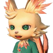
Fragrant Posted January 25, 2016 Author Report Share Posted January 25, 2016 TTL: Yeah, it should be fine, they're on different teams/groups anyway. Which means if they ever encounter each other, they'll fight. Plus, the gryphon's got way more black. That's the Mantis Shrimp dude. I don't remember his name or I might not have given him one yet. Anyway, right now I'm just experimenting with art, for example, art without lines, I picked a random subject to test on rather than my own character, since it would be simpler to draw. http://s20.postimg.org/3m50wrm31/supasanic.jpg Quote Link to comment Share on other sites More sharing options...
Nomrah Posted January 26, 2016 Report Share Posted January 26, 2016 http://s20.postimg.org/3m50wrm31/supasanic.jpg Quote Link to comment Share on other sites More sharing options...
YUNG MASTERLESS GLENCOUR Posted January 26, 2016 Report Share Posted January 26, 2016 gotta have more giolith Quote Link to comment Share on other sites More sharing options...
Fragrant Posted January 27, 2016 Author Report Share Posted January 27, 2016 Giolith and a few others like the Kickada where suppose to be on that list, but it got late before I could get to them. Quote Link to comment Share on other sites More sharing options...
YUNG MASTERLESS GLENCOUR Posted January 27, 2016 Report Share Posted January 27, 2016 oh word Quote Link to comment Share on other sites More sharing options...
Fragrant Posted January 28, 2016 Author Report Share Posted January 28, 2016 Anyway, most of all that I'll continue at the end of the month, I got a client work that will be done by the weekend. I was working on this, but I'll continue it in 2 days or something. This will have a background to it, right now it's very unfinished, but I was testing out this new ink method. http://s20.postimg.org/yll31a5cd/Designs_Roster2.jpg Quote Link to comment Share on other sites More sharing options...
Fragrant Posted January 31, 2016 Author Report Share Posted January 31, 2016 Finally got around to inking this art from 2012. It's from a series with no name, before Grydpher or Rayburst was made, but uses a more serious style. I just remembered, I would rather tackle this epic series years from now. There's an analog of every character from the other series. http://s20.postimg.org/jyxwouavh/illusionist0.jpg EDIT: Finished this.http://i.imgur.com/ilyyZpc.png Quote Link to comment Share on other sites More sharing options...
YUNG MASTERLESS GLENCOUR Posted February 1, 2016 Report Share Posted February 1, 2016 im not rly feeling that painting much, well at least not the yuki onna, i dunno just not feeling that the elf is kinda neat tho the turtle girl looks p cool tho at least Quote Link to comment Share on other sites More sharing options...
Fragrant Posted February 2, 2016 Author Report Share Posted February 2, 2016 (edited) Thanks, yeah, it didn't turn out the way I wanted it in the end. I'm not a real coloring type I guess, I'm more a black and white artist. If I get good full color illustrations, it's usually because I spent too much time on it. Anyway, I'm just sticking to simpler color images, speaking of which, I got a new simple illustration below, of the kappa girl. http://i.imgur.com/Xk2oeqp.png Some bench testing of my new tablet, which I hadn't done seriously since I got it months ago. I think I found the best setting for comics,and the best setting for line art meant for illustrations.http://i.imgur.com/9NHhAu1.jpg EDIT: Yukiko and Baratus.http://i.imgur.com/7VsEB1L.png Edited February 1, 2016 by Fragrant Quote Link to comment Share on other sites More sharing options...
YUNG MASTERLESS GLENCOUR Posted February 2, 2016 Report Share Posted February 2, 2016 i like those much more than the painting, yeah Quote Link to comment Share on other sites More sharing options...
Fragrant Posted February 3, 2016 Author Report Share Posted February 3, 2016 TTL: Thanks, I think they are better, I'm more suited to that type of illustration anyway. Anyway, finally got the design of the last two from that roster thing done. Sort of. All those forms of the rock guy are canon, it's just everytime he's defeated{since he's an antagonist sort of} he comes back in a different form sometimes. I don't know which to pick for the fighting game, probably the version where has a chin and faces on his shoulder, lol. The other character is a hair monster, her true form is just a head, and she uses her hair to form herself a body. Her fighting style would involve normals that stretch out, kind of like necro, dhalsim, Axl Low, and other stretch types in games. http://i.imgur.com/IDOPwuP.jpg EDIT:While the rock guy is a slow heavy hitter with insane defense, I forgot to add the character that is a heavy hitter, but has no power ups, no projectiles, just all physical moves, which means he hits really hard from the getgo. This lion guy, best physical moves in the game, all power. The design on the right middle, rather than left middle is what I'll be going with. Left middle would be the a mid-boss, but his outfit is regal, rather than rags, which he has there. I had the lion idea while I was walking months ago, but didn't put it down on until I knew his actual fighting style.http://i.imgur.com/dnLKvW0.jpg The ogre can only match his strength by using powerups, by default, he'd be weaker. The third heavy hitter in the game is Giolith, he is faster than these two, but still a big target like them. There might be a 4th heavy hitter, a metal person, I might pick the metal armadillo or this metal guy I had drawn somewhere. Quote Link to comment Share on other sites More sharing options...
YUNG MASTERLESS GLENCOUR Posted February 4, 2016 Report Share Posted February 4, 2016 the lion is interesting i rly dig it but i'd like to know what his colors would be? the rock guy is okay the hair girl im kinda w/e about Quote Link to comment Share on other sites More sharing options...
Fragrant Posted February 4, 2016 Author Report Share Posted February 4, 2016 TTL: He'll be a very light yellow, as for his mane, might be brown or blonde, maybe even orange{but too many have orange hair already}. I can't wait to see rock guy and lion guy duke it out. They might be rivals, since they both have the highest attack power. http://s15.postimg.org/46bgkec57/Lions_Rage.png As for the rock guy, his top row, second form and second row guy with shoulder faces are the best. I might modify the former by giving him thicker legs instead of the measly no leg day thing. Quote Link to comment Share on other sites More sharing options...
Fragrant Posted February 6, 2016 Author Report Share Posted February 6, 2016 (edited) I finally got around to trying out 3D modeling, here are #3 and #4, an abomination and a mud golem. http://i.imgur.com/6t9Xtbx.jpg http://i.imgur.com/DLvHlmD.jpg I spent several hours on a 3D model, picked Ritrika with a different outfit, here's the result. She's off model though since her hips aren't suppose to be that big. I'll fix it later though, since some other female characters have a body type like that. http://i.imgur.com/cc9hfRe.jpg EDIT: ALT COLORS: http://i.imgur.com/Lgap0Xt.jpg EDIT 2: Worked some more on the Ritrika model, small hands, thinner limbs, and so on. http://i.imgur.com/XDXPyjz.png http://i.imgur.com/PIz2Fpr.png Edited February 6, 2016 by Fragrant Quote Link to comment Share on other sites More sharing options...
YUNG MASTERLESS GLENCOUR Posted February 6, 2016 Report Share Posted February 6, 2016 what u could do with rock guys legs ur already doign with the 3d models i was thinking bulk up the lower halves like megaman, it takes away from how scrawny the upper legs are the lion guy's colors i gotta be honest i dont like at all, at least the first colorway, the 2nd one isnt so bad but i dunno...doesnt seem too inspired he looks great tho Quote Link to comment Share on other sites More sharing options...
Fragrant Posted February 6, 2016 Author Report Share Posted February 6, 2016 Yeah, in 3D it made sense to give him those legs. Anyway, If I made the rock guy again, I could make it wayy better than that. Yeah, me neither, poor color choices for the Lion. I'm still thinking about what to give him for colors. Looks like the sequel to Rayburst will be in 3D. Although, since it hasn't technically been released, the 3D game might have a different name, something like RayBrawl, Rayverse, or Rayduel. Quote Link to comment Share on other sites More sharing options...
Fragrant Posted February 8, 2016 Author Report Share Posted February 8, 2016 I made Ritrika from scratch, gave her a new costume, it's basically the 5th costume she's had since her initial debut. I used reference I had to get her height and ratio right. Her new outfit reflects her fighting style better.http://i.imgur.com/wj795Sv.png Phreit Nor, Unmasked. Plus a new suit design. Trying to figure out the colors still, or if I should stick with the old color scheme. Another alternative is to add a little red, possibly for his hat, since his skin is blue.http://i.imgur.com/WBduIm3.png I should probably get back to finishing the 2D games. Quote Link to comment Share on other sites More sharing options...
YUNG MASTERLESS GLENCOUR Posted February 8, 2016 Report Share Posted February 8, 2016 i like the updated outfit more also idk if u should add red, the blue skin actually doesnt look that bad, i'd say go with the black like before but that'd look wrong in the 3d (the old art style made more sense for that) Quote Link to comment Share on other sites More sharing options...
Fragrant Posted February 11, 2016 Author Report Share Posted February 11, 2016 TTL: True, and thanks, yeah, I might not use red afterall. I'll keep testing for better color schemes for all of them. Anyways, new stuff, didn't get to paint Grafto, still needs some work anyway. http://i.imgur.com/vmZkzkY.jpg http://i.imgur.com/kxB6w4w.jpg http://i.imgur.com/U7nL9xm.png http://i.imgur.com/FFWmM55.png Quote Link to comment Share on other sites More sharing options...
Recommended Posts
Join the conversation
You can post now and register later. If you have an account, sign in now to post with your account.